Overview: The Resource Report View is a new addition to provide users with a comprehensive and visual representation of resource allocation and timesheet logs. This feature enhances reporting capabilities, allowing users to analyze and optimize resource utilization efficiently.
Benefits:
Visual Resource Overview: Access a visual representation of resource allocation, making it easier to identify bottlenecks, overloads, or available capacity
Data-Driven Decision Making: Utilize the Resource Report View to make datadriven decisions regarding resource allocation, project timelines, and overall workload management. At the same time, the allocated resource and the logged time, that is, the time worked and the billable and unbillable status of this time can be analyzed
How it works ?
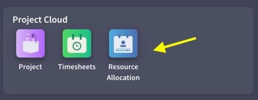
- Go to Resource Allocation app from Project Cloud.

- Click on Report View icon from resource allocation page

- You can see the data about allocations and logged timesheets.
How to read the graph?
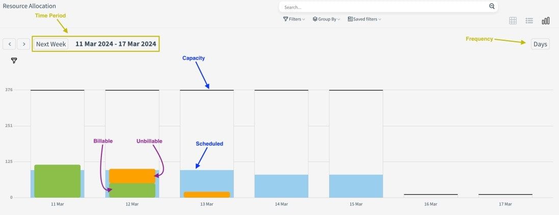
The line at the top of the bars in the Graph shows the current (day, month, year) capacity.
The blue bar shows the scheduled resource, the green bar shows the timesheets logged as billable and the orange bar shows the timesheets logged as unbillable.
Chart data is dynamically recalculated according to the selected time periods. It can also be analyzed in daily, weekly and monthly views for the selected time period.

The KPI cards under the chart show the total capacity in the selected date range, how much of this capacity is scheduled, how much is unscheduled, their percentage ratios, how much of the logged timesheets are billable, how much is unbillable and finally the scheduled overtime.
In the table below the KPI cards, both a resource-based and project-based review can be made.

